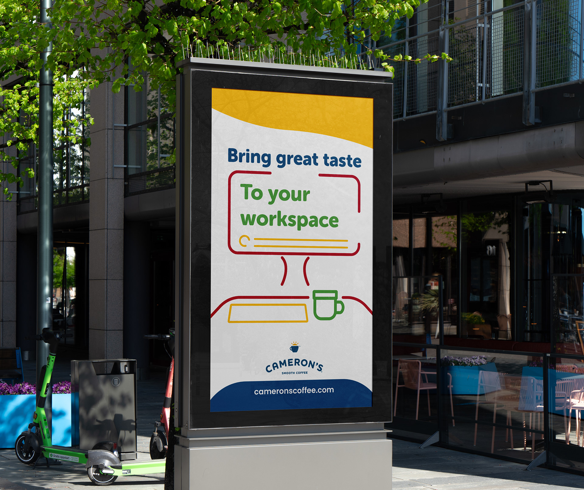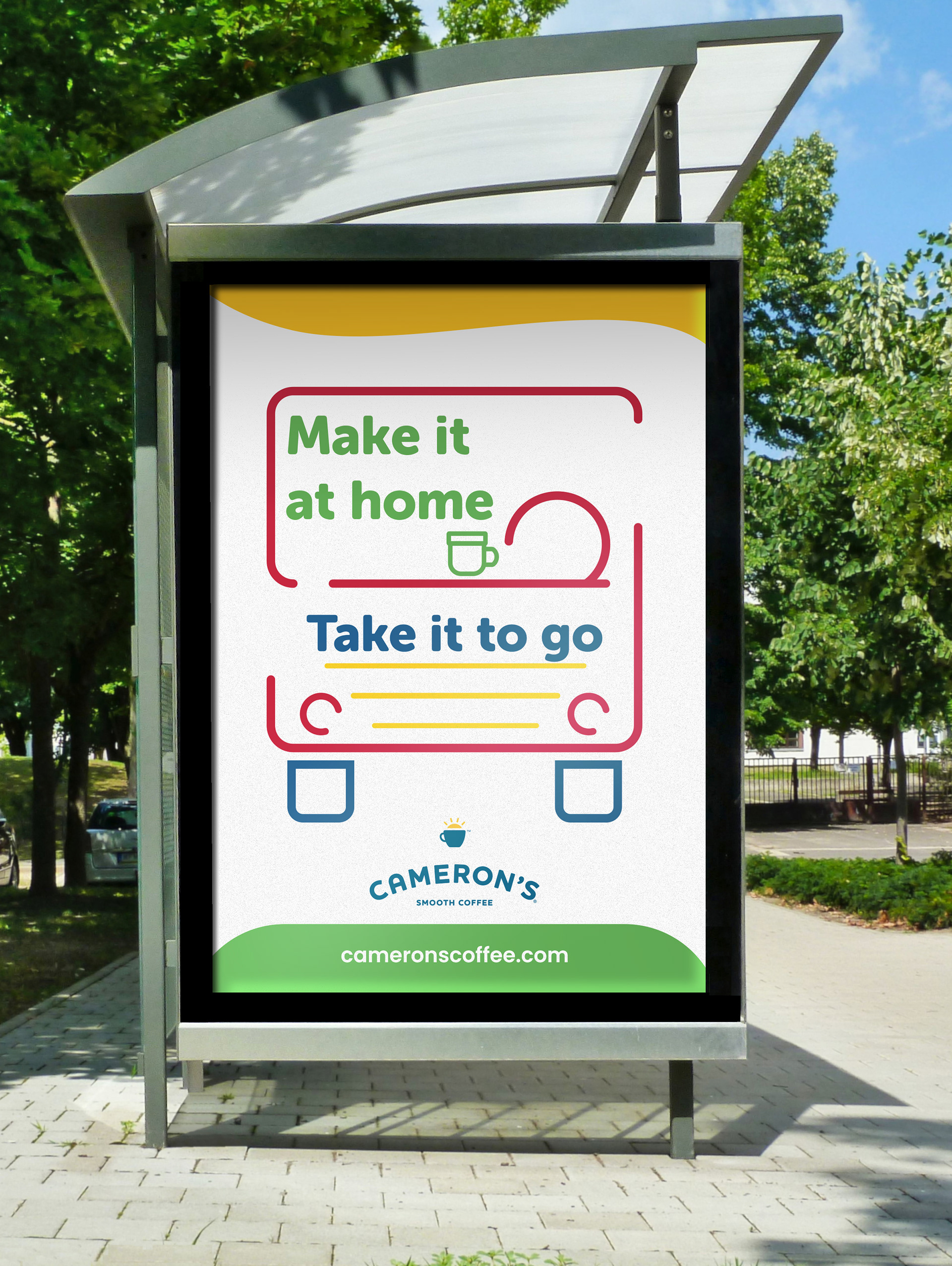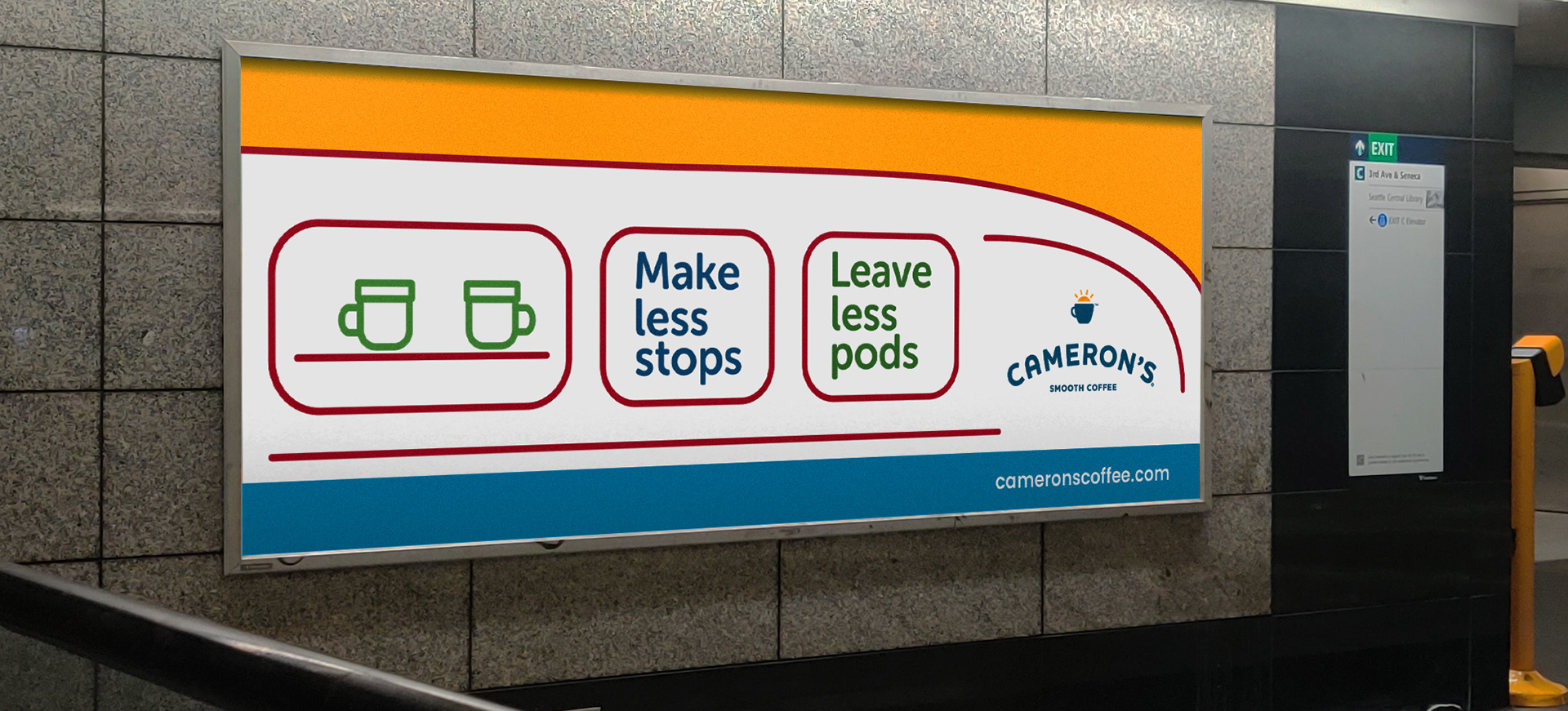


These designs were intended to be seen by work commuters using public transportation or walking, and encouraging them to make coffee at their homes using Cameron's. The colors create consistent and simple art in the style of Cameron's branding. The typeface was chosen to create a kind, casual appearance, and to represent Cameron's focus on eco-friendly coffee by its color.
